KeepTRAC™
KeepTRAC™ is a digital customer engagement platform for utility companies that includes optimal integration of utility bill presentment, payment processing and customer engagement in one user-friendly web portal.
Services: UX Design, UI Design
The Task at Hand
From monthly usage reports to payment history, users should be able to explore their profile from one easy-to-use central location. With multiple levels of data we needed to create an experience that presented the important data first while allowing the user to easily make payments and update information. We worked alongside Bill2Pay to optimize their user flows and information architecture while also enhancing the overall aesthetic of their payment portal.
UX Challenges
KeepTRAC™ will be the hub for a very large amount of information about the user and accounts they have with their utility company. We needed to decipher the hierarchy of data in order to present the most important information to the user first, while keeping the secondary data just a couple clicks away. The client also wanted a way for the utility companies to slightly customize the look of the the portal to make it more inviting to users once they were logged in.
Since the platform will be used by several different types of users from homeowners, to business owners, to landlords with multiple properties, we had to think through several scenarios to come up with the the best way to display the data to these user groups. We also had to develop an option for those users that just want to quickly pay their bill instead of taking the time to create a profile.
UX Solutions
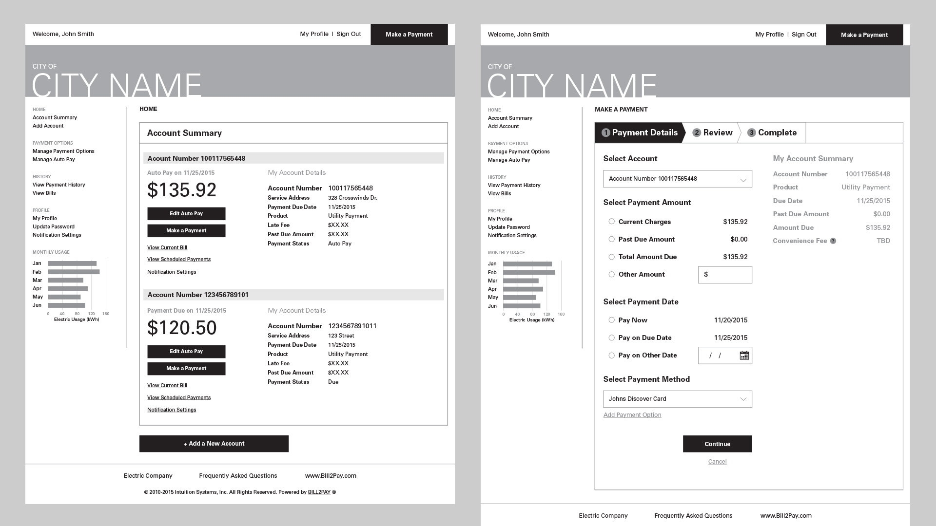
We created a responsive dashboard that displayed the most important payment information front and center along with a small snapshot of the user’s account information. We developed a sidebar navigation that is organized into five easy-to-identify sections that help the user dive deeper into their data. At the top of the page is a header with a full width banner image that the utility company can update depending on the location of the user along with the name of their location.
On the login page we created an express option for the users that just want to make a one-time payment without creating a profile. Similar to ecommerce platforms, we provided an option at the end of the payment process to easily create a profile using all of the information that the user just provided.
Team
Client - Bill2Pay
Agency - Wingard
Senior Art Director & UX/UI Designer - Sean Kinberger
Digital Director - Adam Berry
Developer - Bill2Pay Development Team


